

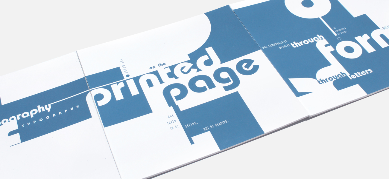
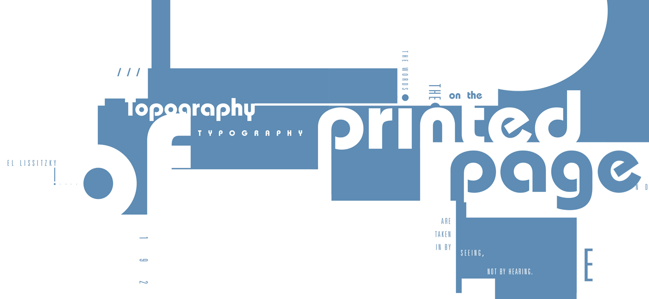
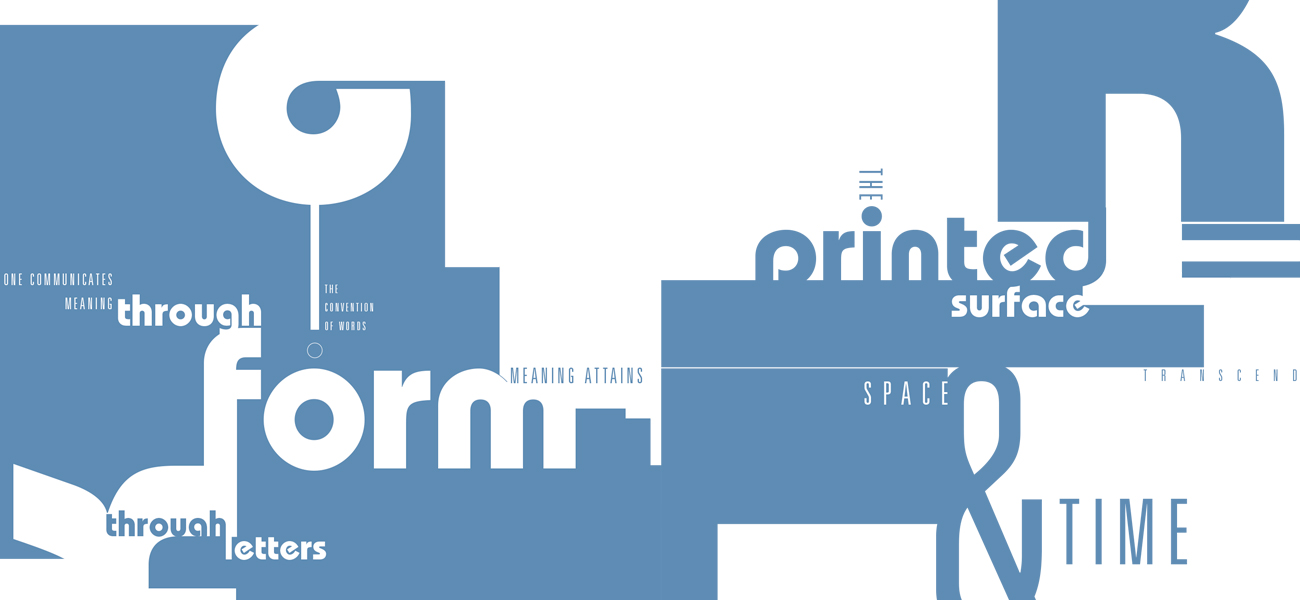
Typography has to be every graphic designers bread and butter. When all else fails we know that we can resort to beautiful type layouts that do not necessarily rely on imagery. For this project we were given a set amount of text and asked to lay it out typographically on four cards. Within each of the cards we had to devise a way to not only layout the reading text but also how can I create beautiful gestalt and composition with only letter forms. Each card represented a different section in the reading and holds its own amount of white space and content making each unique on its own but able to work well along side the other cards.
Date
Fall 2017